Analysing the output
The results.csv.bz2 file contains all of the population trajectories
from the nine model runs. You can explore this using Python pandas, R,
or Excel as you did before. Using
ipython or Jupyter notebooks with pandas, we can load up the file;
>>> import pandas as pd
>>> df = pd.read_csv("output/results.csv.bz2")
>>> print(df)
     fingerprint  repeat  beta[2]  too_ill_to_move[2]  day  ...         S  E  I         R  IW
0            3_0       1      0.3                 0.0    0  ...  56082077  0  0         0   0
1            3_0       1      0.3                 0.0    1  ...  56082077  0  0         0   0
2            3_0       1      0.3                 0.0    2  ...  56082072  5  0         0   0
3            3_0       1      0.3                 0.0    3  ...  56082072  0  5         0   0
4            3_0       1      0.3                 0.0    4  ...  56082071  0  5         1   1
...          ...     ...      ...                 ...  ...  ...       ... .. ..       ...  ..
1764         5_5       1      0.5                 0.5  172  ...   6304109  0  5  49777963   0
1765         5_5       1      0.5                 0.5  173  ...   6304109  0  4  49777964   0
1766         5_5       1      0.5                 0.5  174  ...   6304109  0  3  49777965   0
1767         5_5       1      0.5                 0.5  175  ...   6304109  0  1  49777967   0
1768         5_5       1      0.5                 0.5  176  ...   6304109  0  0  49777968   0

[1769 rows x 11 columns]
This is very similar to before, except now we have extra columns giving
the values of the variables that are being adjusted (columns
beta[2] and too_ill_to_move[2]. We also now have a use for the
fingerprint column, which contains a unique identifier for each
pair of adjustable variables.
Note
The fingerprint is constructed by removing the leading 0. from
the value of the adjustable variable, and the joining the values
together using underscores. Thus 0.3 0.0 becomes 3_0,
while 0.5 0.5 becomes 5_5.
Finding peaks
We can use .groupby to group the results with the same fingerprint
together. Then the .max function can be used to show the maximum
values of selected columns from each group, e.g.
>>> df.groupby("fingerprint")[["day", "E","I", "IW", "R"]].max()
day E I IW R
fingerprint
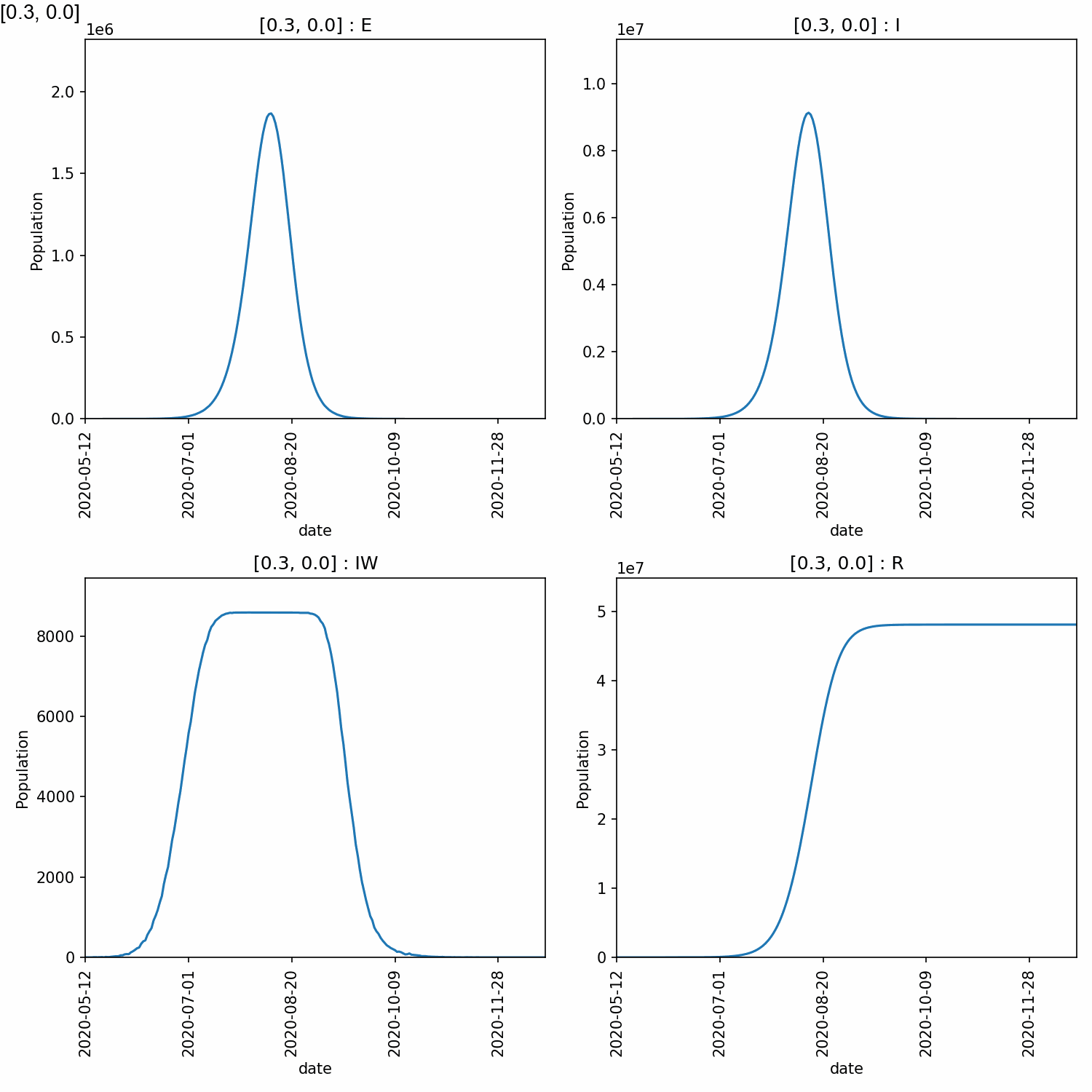
3_0 204 1767303 8665472 8588 48105748
3_25 205 1908160 9296754 8588 48076343
3_5 215 1844377 9024418 8588 48036902
4_0 192 1947245 9532789 8588 49042717
4_25 210 1965166 9614400 8588 49009034
4_5 200 2095342 10179621 8588 48975523
5_0 175 2207896 10714530 8588 49857969
5_25 183 2120481 10326984 8588 49821966
5_5 176 2117730 10330952 8588 49777968
From this, we can see that higher peaks occured for higher values of beta, which is expected. However, different values of too_ill_to_move had little impact on the peaks.
Warning
Do not over-interpret the results of single runs, such as the above. There is a lot of random error in these calculations and multiple model runs must be averaged over to gain a good understanding.
Plotting the output
There are lots of plots you would likely want to draw, so it is recommended
that you use a tool such as R, Pandas or Excel to create the plots that
will let you explore the data in full. For a quick set of plots, you
can again use metawards-plot to generate some overview plots. To
do this type;
metawards-plot -i output/results.csv.bz2 --format jpg --dpi 150
Note
We have used the ‘jpg’ image format here are we want to create animations.
You can choose from many different formats, e.g. ‘pdf’ for publication
quality graphs, ‘png’ etc. Use the --dpi option to set the
resolution when creating bitmap (png, jpg) images.
As there are multiple fingerprints, this will produce multiple overview graphs (one overview per fingerprint, and if you have run multiple repeats, then one average per fingerprint too).
The fingerprint value is included in the graph name, and they will
all be plotted on the same axes. This means that they could be joined
together into an animation. As well as plotting, metawards-plot has
an animation mode that can be used to join images together. To run this,
use;
metawards-plot --animate output/overview*.jpg
Note
You can only animate image files (e.g. jpg, png). You can’t animate pdfs (yet - although pull requests welcome)
Here is the animation.
Jupyter notebook
In addition, to the metawards-plot command, we also have a
Jupyter notebook
which you can look at which breaks down exactly how metawards-plot
uses pandas and matplotlib to render multi-fingerprint graphs.