Plotting outputs
You should now have a results.csv.bz2 file in the output directory,
which contains the results of four model runs of the outbreak of the
lurgy that was seeded in London.
You can plot graphs of the result using the metawards-plot command. To run this, type;
metawards-plot --input output/results.csv.bz2
Note
metawards-plot uses pandas and
matplotlib for plotting. If you don’t have
these on your computer then you will see an error message giving
instructions on how to install the packages. Note that the default
format of the output is jpeg. You can change the format using the
--format option, e.g. --format png or --format pdf.
You may need to install
Pillow
to support output in some file formats.
Understanding the graphs
This will create two sets of graphs;
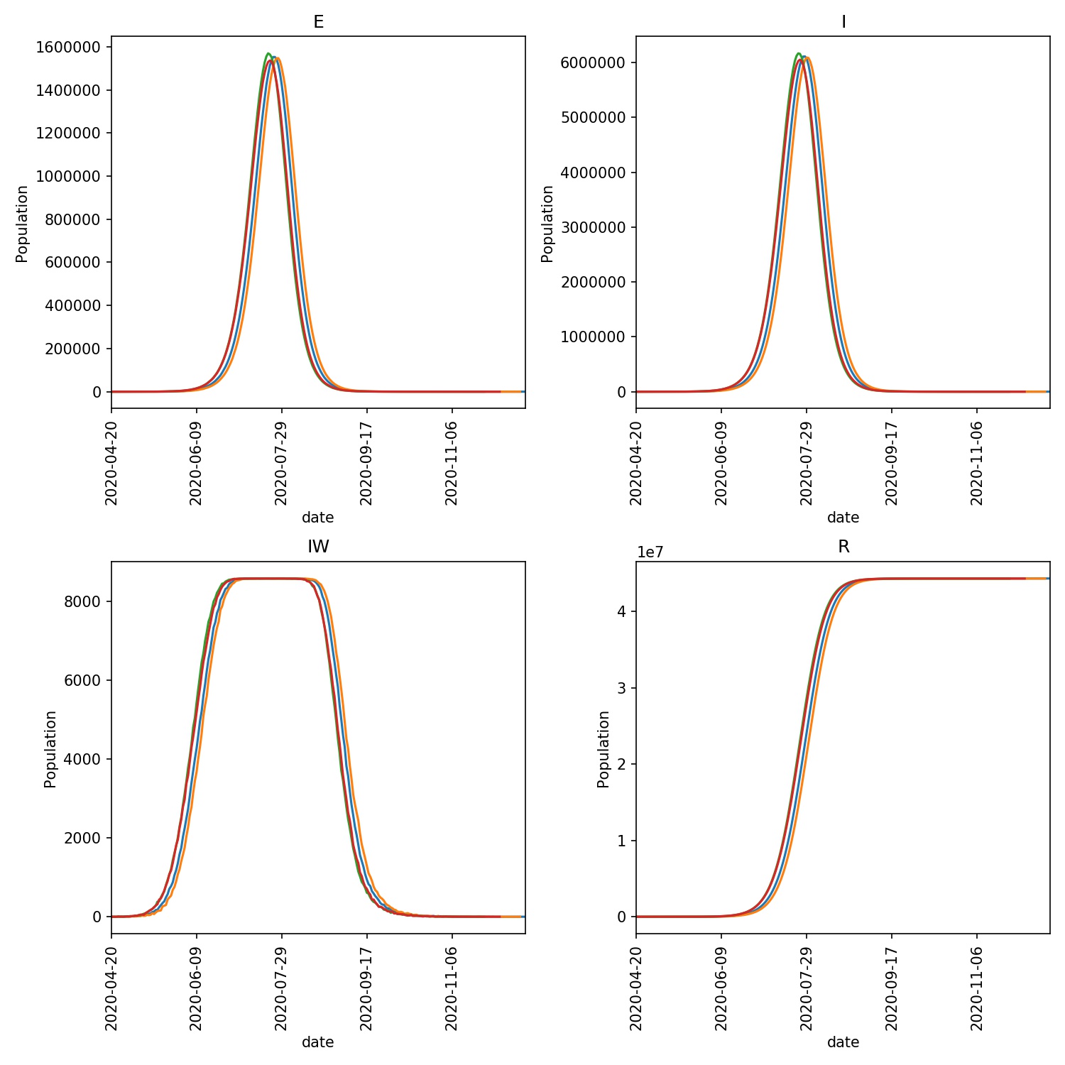
output/overview.pdfThis is an overview of the E, I, IW and R values from each day of the model outbreak for each of the four model runs. Your graph should look something like this;
output/average.pdfThis shows the average of the E, I, IW and R values, with the standard deviation shown as the error bars. Your graph should look something like this;
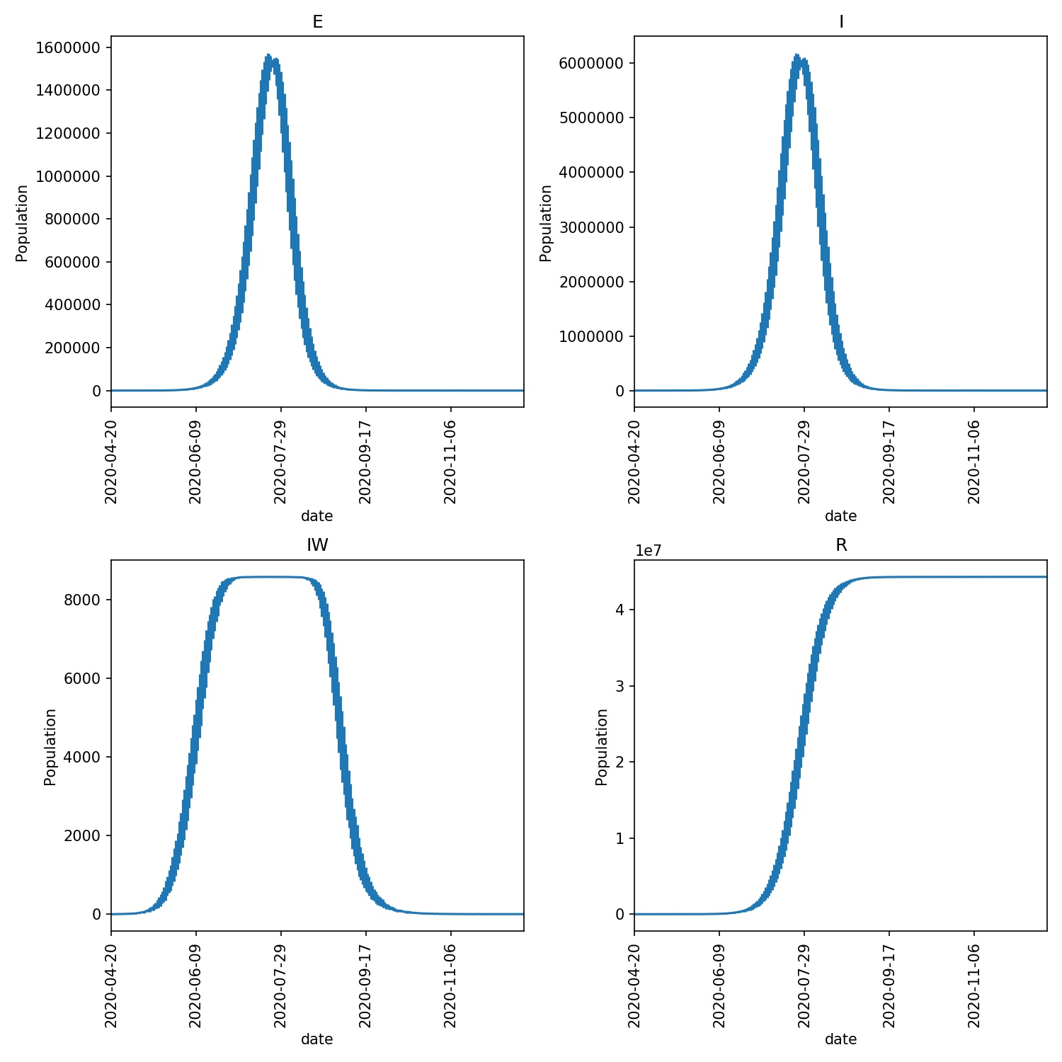
The E graph shows the total number of latent infections. It should be slightly ahead of and of a similar shape to the I graph, which shows the total number of infections.
The IW graph shows the number of wards with at least one infection. This cannot grow to more than the total number of wards, hence why you see this graph topping out at ~8588, as this is the number of wards.
The R graph shows the number of individuals removed from the epidemic (e.g. as they may have recovered). This should have an “S” shape, showing exponential growth in the initial stage of the epidemic that tails off as the number of individuals susceptible to infection is reduced (e.g. as immunity in the population is built up).
Note
Your graphs may look a little different in the exact numbers, but should be similar in shape. The purpose of this type of modelling is not to make exact numerical predictions, but to instead understand trends and timelines.
Jupyter notebooks
The metawards-plot command can be used for quick-and-simple plots.
If you want something more complex then you can take a look at the functions
in the metawards.analysis module. In addition, we have a
Jupyter notebook
which you can look at which breaks down exactly how metawards-plot
uses pandas and matplotlib to render these two graphs.